Global Point Sourcing Solutions (GPSS) faced an identity crisis as a newly formed business entity. Three brands were coming together under this new name which provided a unique challenge... how to showcase the change and provide a united front digitally?
The Rebrand

GPSS came in with a logo that worked, but nobody believed in it. If no one internally was proud to wear this new company name on their sleeve, how would they make a big splash?
The globe icon used in their current logo felt overused and slightly on the nose. Other aspects, such as color compliance, also posed a potential issue with the current logo. They wanted a logo that represented the out-of-the-box solutions their business provides in the inventory management industry.

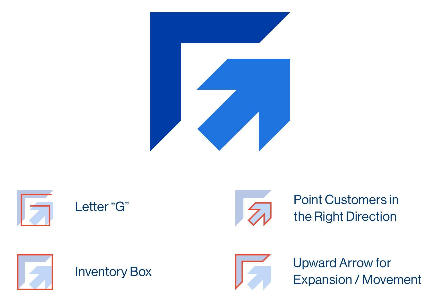
After discussion meetings, research, and lots of brainstorming, JH presented Global Point logo options that would fit their business best. Ultimately, they chose the logo above.
When done correctly, a logo has meaning. This meaning doesn't always have to be blatantly obvious to the everyday viewer; however, you can use your website and other marketing materials to explain the meaning. Ripping images from the internet and putting together a logo will not produce a brand your company can be proud of showing the world.

In the new Global Point Sourcing Solutions logo, there were multiple hidden meanings. The lighter blue upward arrow represents pointing customers in the right direction. The rigid, sharp angles create a square composition meant to represent an inventory box. The upward dark blue arrow represents expanding on a global scale. Finally, the entire composition flows into the letter "G" standing for "Global". There were lots of other reasons behind the formation of the logo including the colors and typefaces chosen.

At JH, we built an entire brand, complete with meaning, logo variations, color palette, imagery, brand type, brand patterns, and more that Global Point Sourcing Solutions can utilize for years to come.
The Website
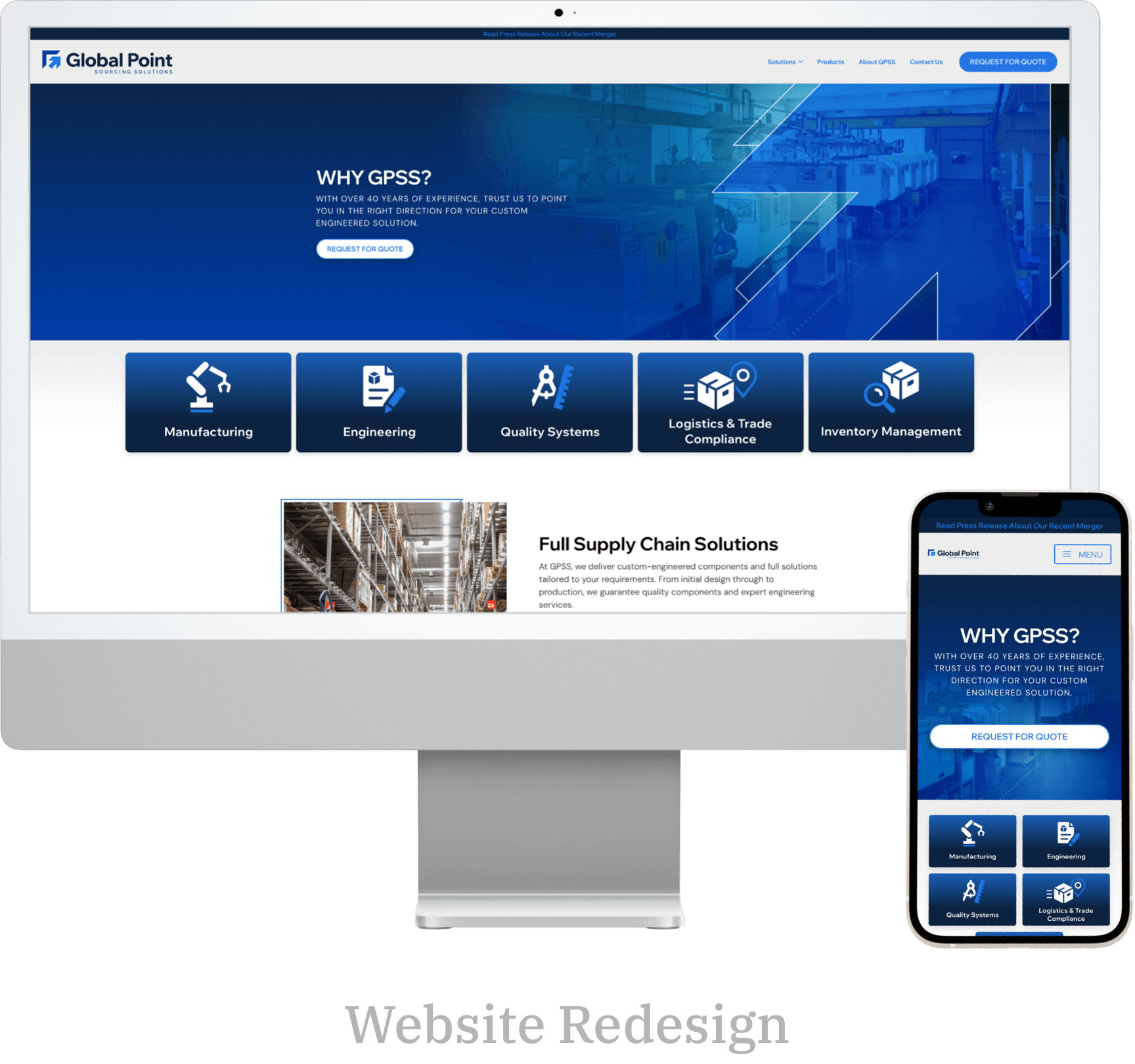
Once the brand was established, it was time to take multiple websites and combine them into one cohesive site. It was the perfect opportunity to determine how to showcase their services and product offerings, while also letting customers and prospective customers know what sets them apart from the competition.
Through round table discussions with the JH team, we were able to obtain the language to be used along with the strengths to be featured. This set the stage for the site structure and user flow.

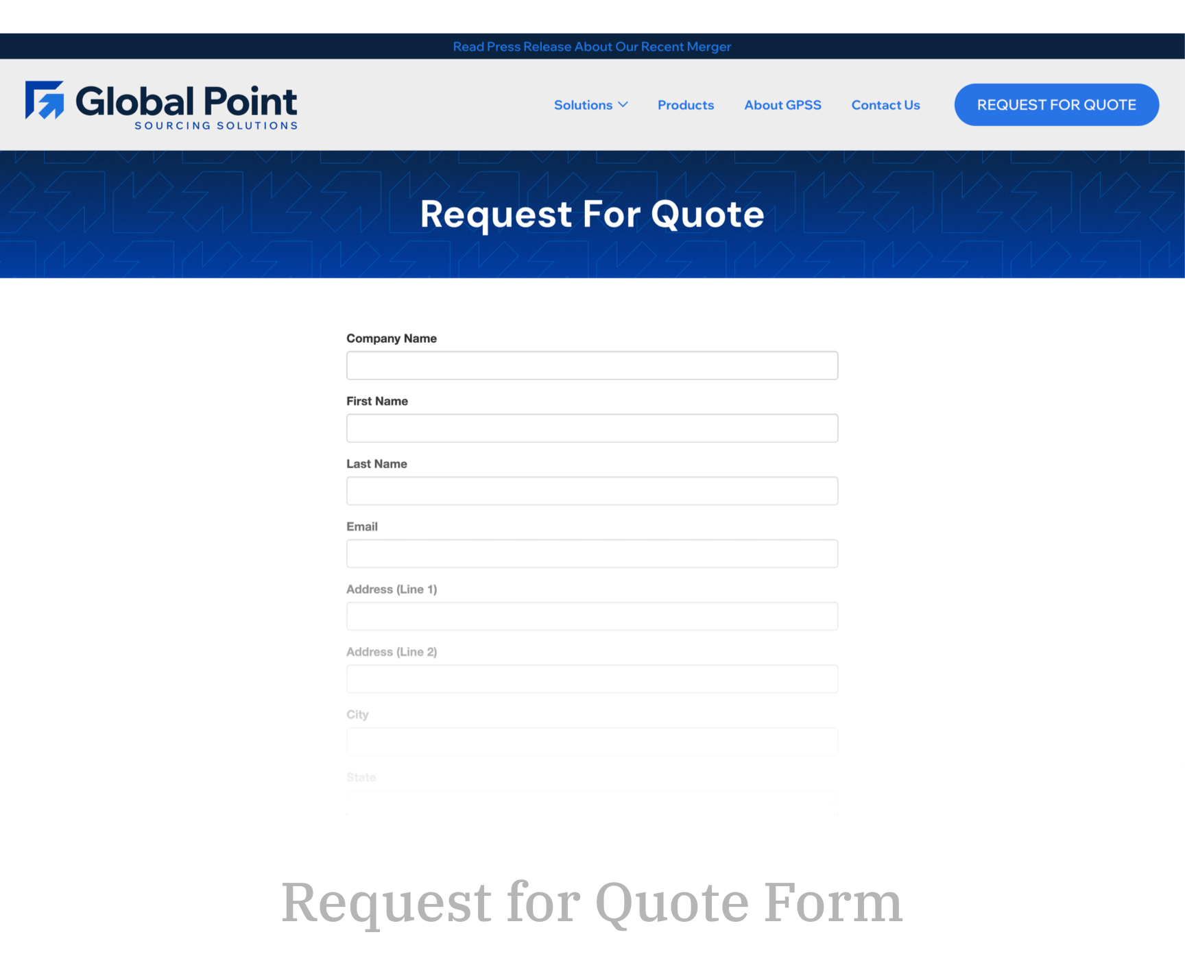
One of the new features was an integrated RFQ form that allows all lines of business to use the same quote request form. This not only makes it easier for customers and prospects to request quotes but streamlines the quoting process on the backend.

On the technical side of things, one of the most important things was ensuring each website was redirected to the new site. For example, customers who always knew Solid Rock LLC was their sourcing partner needed to get to the new GPSS website seamlessly and understand the merger. While this seems like an easy task, merging businesses previously managed by a wide variety of other third-party partners proved to be an elaborate game of telephone.
The new brand and website establishes GPSS in the industry as a top competitor, that can move forward into the future with confidence in their brand identity. We'd like to thank Global Point Sourcing Solutions for entrusting JH with their rebrand and new site development. If you're looking to redesign your branding or need a new responsive website, reach out to our team today.


