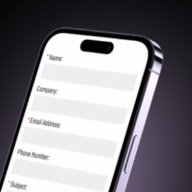
Would most agree that web forms are the most revolutionary thing on websites today? Probably not, but in my (geeky) mind they are the unspoken hero by helping nearly every type of business’s efficiency and increasing revenue: watch me change your mind.
Web forms can do so many valuable things like gaining leads that turn into sales, finding new employees and collecting valuable data that helps grow your business. And that’s just the beginning!
They have an outstanding return on a small investment (with enough submissions) because they are inexpensive and easy to implement.
Side note: If you’re curious about the evolution of web forms like I was, take a trip down memory lane.
(Source)
How Can Forms Be Used?
Contact
Most websites today should have this type of form, sometimes named “Contact Us”. This allows for the user to ask questions, voice concerns, explain the need for a refund and other similar uses for the business.
Employment Application
These be as short as a scaled-down screening process, or full application integration. Keep in mind that the candidate’s experience here is crucial. In a survey by C and E, 46 percent of candidates stated they’d sever a business relationship with a brand and go elsewhere after suffering a poor application experience.
Survey
Results from these form submissions will help you learn more about the user experience with your products and services. In turn, that will help you learn what your customers really want and how you can help.
Lead Forms
This is my favorite and plan to do a deep dive on in the future
When a customer is interested in a product or service that you offer, they need to contact you. If they can find the phone number, or email, reach the right person, and ask the right questions.
A form will offer much less friction, allows you to collect the data needed and prepare the estimate, get back in a timely fashion that works for both of you(maybe a good question to include on the form)."
Frankly, most website users today would rather fill a short form than make a phone call.
Fact: Inbound marketing brings leads to you, generating (on average) three times more leads per unit spent than traditional methods. [Content Marketing Institute]
Here are some additional ideas for ways to use web forms:
- Gather contact information to opt in for email, text, newsletters, and more
- Process orders
- Accept payments
- Collect donations
- Record incidents
- Field donation requests
- Provide quotes for materials
- Provide estimates for services
- Registration for new members, events, or services
- Ticketing system
What’s Important to Know?
Forms must be user-friendly and easy to read. Most importantly, they must be easy to fill out on a mobile device as over 50% of users are using a mobile device to access your site.
According to Monetate, mobile conversion rates are 1.82% compared with 2.57% on desktop, so you can see the importance of ease of use on mobile.
The good news is that there is no “one size fits all” when it comes to form implementation, which allows room for tailoring to your business needs with creativity.
So, How Do You Start?
- Map out the form first on paper or a spreadsheet
- What is the purpose and must-knows from a business standpoint?
- How should it flow from the user standpoint?
- Choose your form type (or modify a template if you’d rather not start from scratch)
- Add your form fields, and embed the form on your site
- Make your form secure, test it, and analyze your results
- Be sure to include proper identification on submissions for easy exports and viewing of data
- Have a system and set a standard for an expected response time
General Best Practices:
- Always require basic contact (like name and email) so you can identify submissions
- Less is more: web forms with as few as three fields have the highest chance of conversion.
- Keep it simple and keep it relevant, even if it’s tempting to collect extra data
- Substitute keystrokes for buttons and sliders where you can
- Avoid duplicate fields (avoiding fields titled “re-type your email address” and other error-protection bits)
- Clearly distinguish required fields to avoid user frustration
- Use description text if the field is not clear, or show an example
- Include error messages that are specific and clear about the missing/incorrect data (Learn more about error messages)
Design Best Practices:
- Make it mobile friendly and use proper spacing
- Make it attractive – forms are boring to users, so make it less painful to fill out!
- Use multiple pages if the form is long to reduce overwhelm and bounces (Customers will even abandon a checkout cart if it appears to be too long or complicated. Source)
- Don’t use multiple columns or zigzag across the page
Web Form Providers:
As you begin your search, you’ll see there are a plethora of suitable and affordable options. Much of it will depend on what you want when it comes to the type and style of form, compliance needs, and export (data viewing and delivery) options.
Here are a few we’ve successfully used with our clients:
- Jotform
- Formstack
- Eventbrite (For online and in-person events, classes, etc.)
- Practis Forms (HIPPA-compliant)
- Stripe (Payments platform)
- GoogleForms
If you need more help with this topic, please fill out this form….Kidding – Shoot us an email, and we’d be happy have a conversation.


